Oak Hill Apiary

Discovery

Oak Hill Apiary is a small, local honey company in Vermont. The founder, Crystal Mansfield, started a new hobby of taking care of bees as an escape from her high-stress career from the local hospital. She quickly went from gifting small honey jars to selling honey to a local baker by the gallons.

Services

Logo Design
Visual Identity
Labels
Messaging
Illustration
Patterns

Goals for the Project

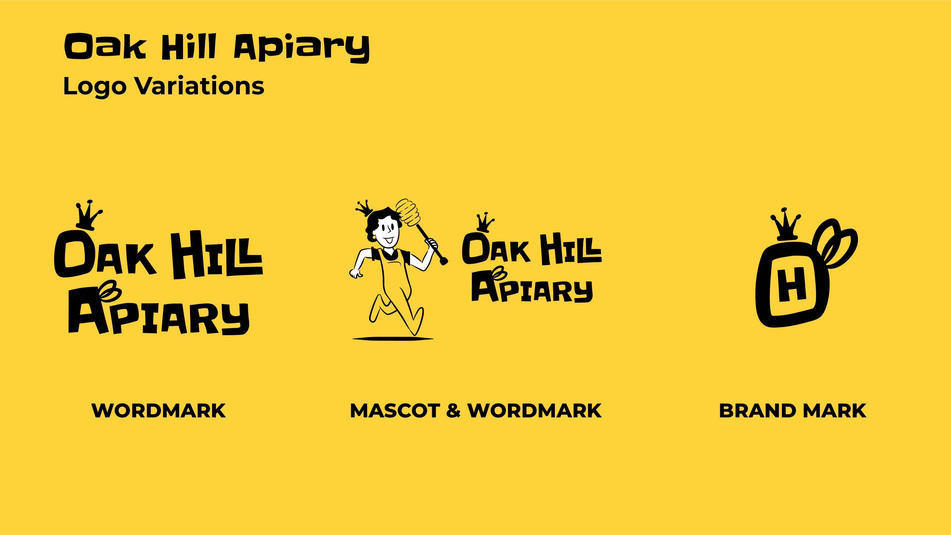
Boutique Logo

Create an unique logo that didn’t look like it was “bought from a beekeeping supply site”

Bold Honey Labels

To design honey labels that would standout on the shelves

Fun & Lighthearted

Something fun and lighthearted, a counterbalance to her serious day job

Flexible Identity System

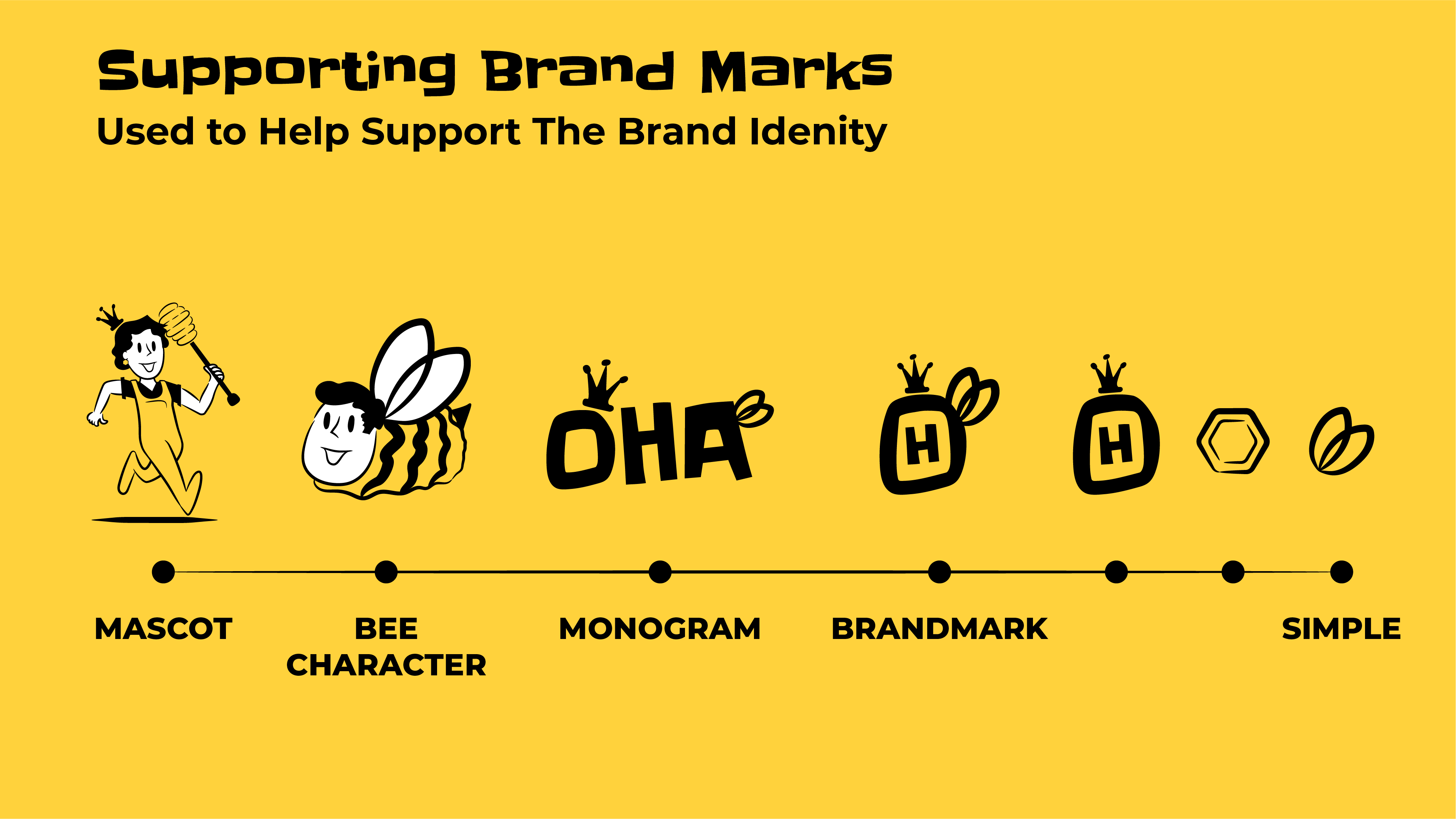
Build a logo system with variations that can be applied across different audience touchpoints.
Design

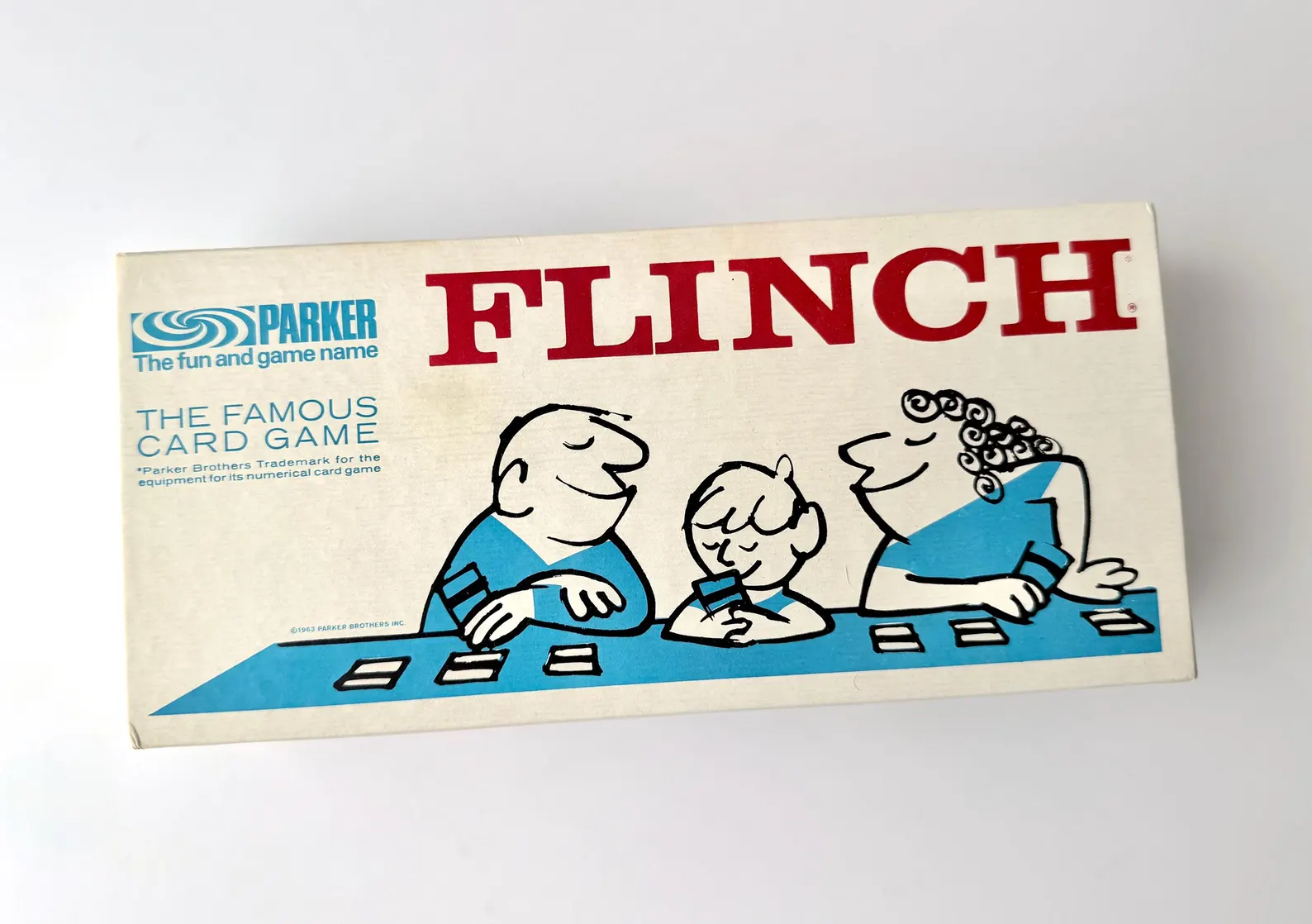
Crystal grew up playing Flinch, a 1963 card game, and its mid-century look became the inspiration for the project.

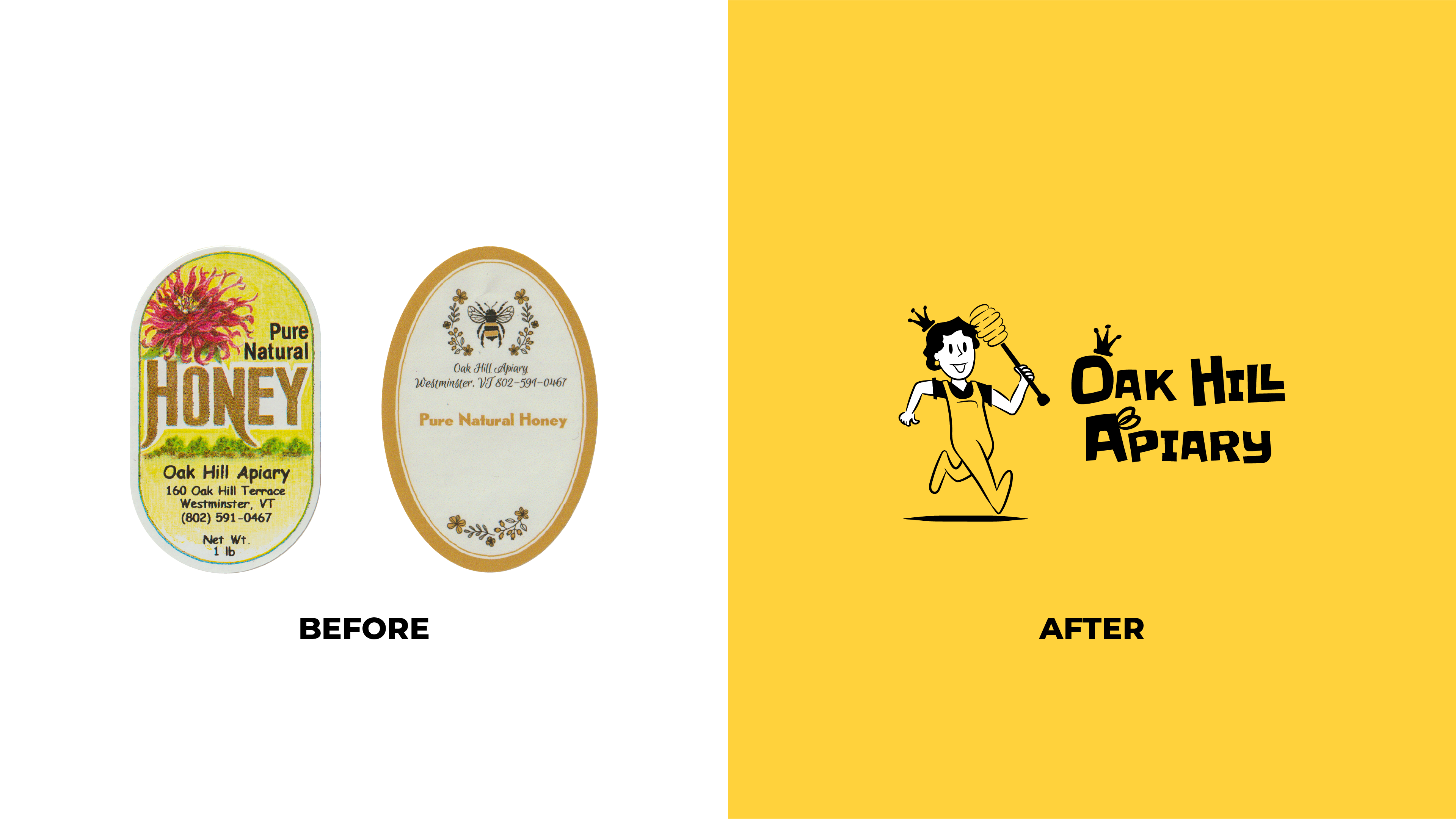
Most of the honey labels in local shops either look like they were ordered from the same honey supply company. The labels were either ornate, decorated and rustic or they used the same imagery making all the brands blend together.

Instead, I choose to go for a mid-century look taking inspiration from UPA (United Productions of America) style Animation, think Hanna-Barbera Cartoons.
A modern, cartoon, loose, bold lines and expressive visual identity calls out to the world that honey is a sweet treat that doesn’t have to look like a prop out of Country Living Magazine.

UPA style came out former Walt Disney Productions employees who wanted to create art that was less logical realism, rather something that loose, less restrictive to achieve their visions.

Delivery

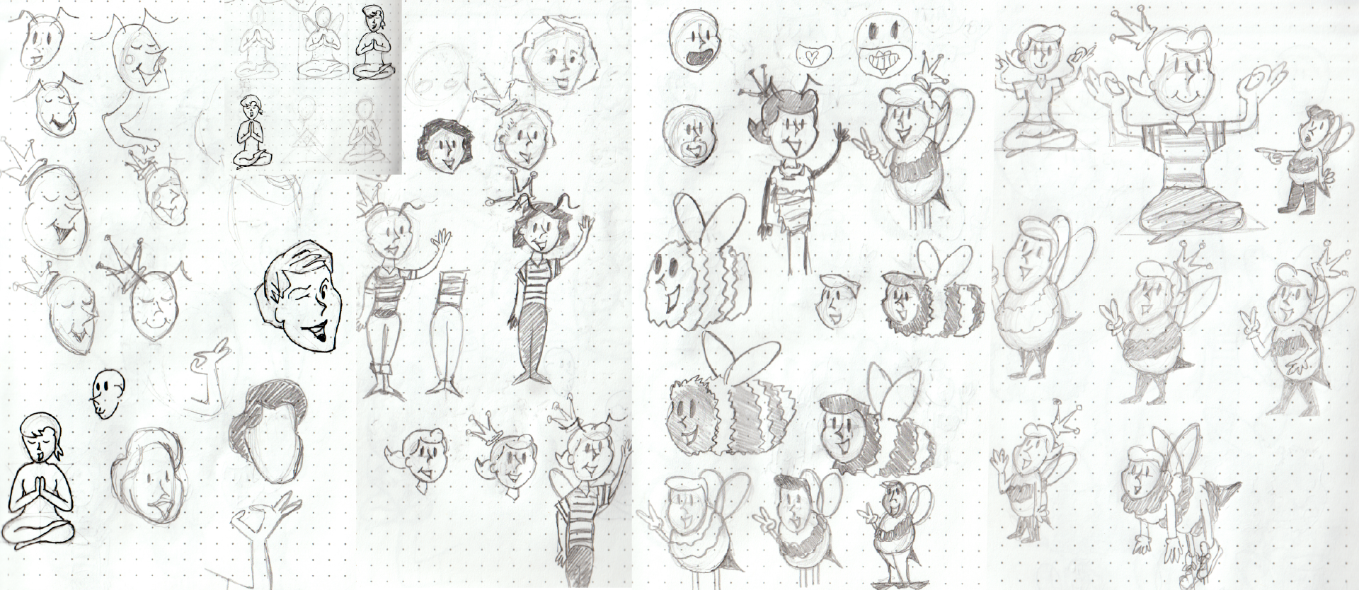
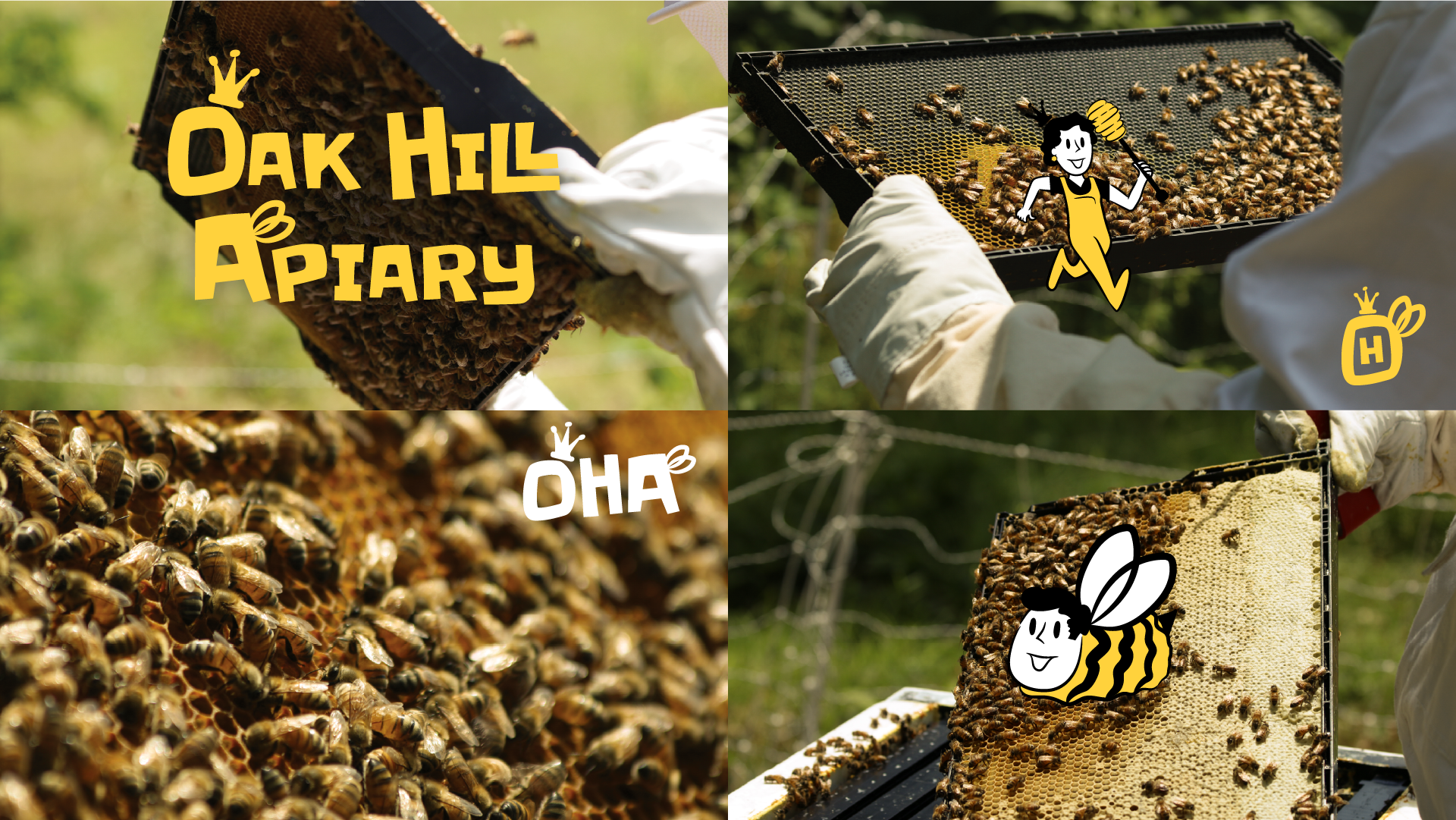
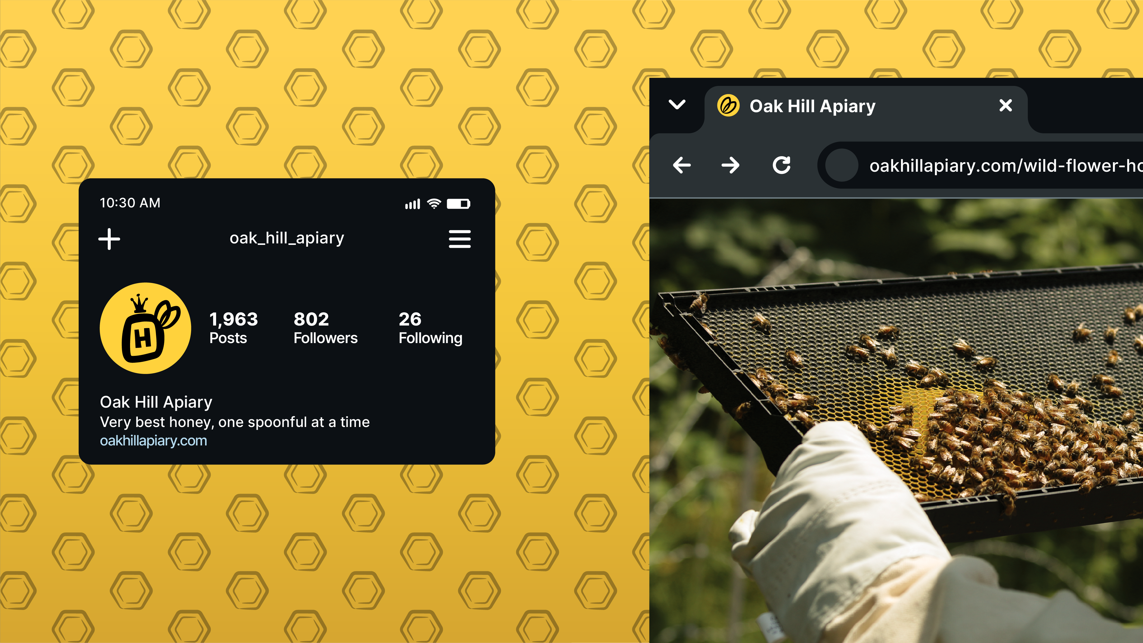
I built a playful flexible visual identity system that can fit across honey jar labels, merchandise, social media platforms and customer touchpoints.

If you’re thoughtful and dedicated to your craft, being playful doesn’t cheapen or makes you less serious. It makes you bold and comfortable in your vision.